
When you first consider creating a dashboard in Excel, it might seem impossible for you as a newbie. Fortunately, creating an Excel dashboard is straightforward. Making a dashboard in Excel allows you to quickly analyze your data in the form of graphs and charts.
This way, your data will not only look good but also be easy to review quickly.
So in this beginner Excel dashboard tutorial, we’ll go over how to build an Excel dashboard to visually show your data.
What is an Excel Dashboard?
Dashboards in Excel generate a picture in the form of visuals from which you can quickly monitor your metrics and reports on every project. In other word, the Excel dashboard is a visual interface that consolidates and displays data from various sources in one place. It typically includes:
- Charts: For visualizing trends and comparisons.
- Tables: For detailed data breakdowns.
- Interactive Features: Like slicers or drop-down menus to filter data.
- Key Metrics: Highlighting the most important insights.
Dashboards are designed to simplify complex datasets and make data-driven decision-making easier.
Example:
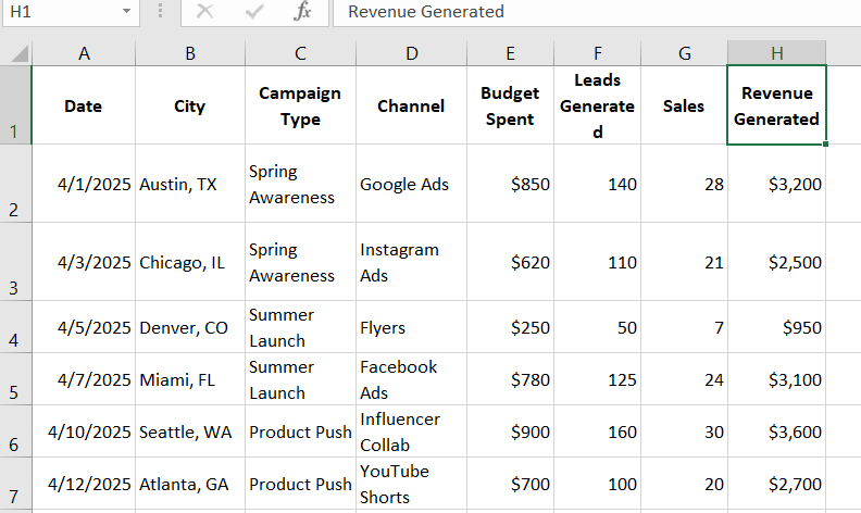
Suppose you work for a small to medium-sized company that runs various local marketing campaigns across cities. For future budgeting and decision-making, you have to keep track of how much you spend vs the results (in leads or sales) for each city and campaign type.
Looking at the table below might leave you bored and confused, and you will need to put in a lot of effort to analyze and obtain results.
Let’s create a dashboard for quickly analyzing data.
Things to Consider Before Creating an Excel Dashboard
Before you create an Excel dashboard, you have to know why you need one. Why do you need to build it? Here are some things you could look up and consider before creating an Excel dashboard:
- Why do you need an Excel dashboard?
- Which audience will you be targeting?
- Which datasheets do you have to use to create a dashboard?
- What things do you have to track?
After having a thorough understanding of these concepts, you will be able to create the dashboard more quickly and efficiently. In this way, you can avoid future headaches and save time on revisions.
Clarity and a clear understanding of what you are doing can save you a lot of time and energy.
Step-by-Step Guide to Create an Excel Dashboard
Here is a step-by-step guide on how to quickly establish an Excel dashboard.
Step 1: Define the Purpose of Your Dashboard
Before diving into Excel, clarify the purpose of your dashboard:
- What do you want to track? (e.g., sales, performance metrics, project milestones)
- Who will use it? (e.g., team members, stakeholders, yourself)
- What insights are most important?
Having a clear goal will help you design a focused and effective dashboard.
Step 2: Gather and Prepare Your data
Every effective dashboard starts with clean, well-structured data. Begin by importing and organizing the data. If the client has provided the data in a file, import it into your Excel worksheet (or copy the data from external sources into your Excel or link it directly using Power Query). Ensure the data sheet is labeled with clear and appropriate headings to make it easy to navigate and understand.
Step 3: Organize the Data using a Table
Convert your dataset into a table (Ctrl + T) so that your data has a consistent structure and formatting. Tables make your data dynamic and easier to manage.

Step 4: Clean your Data
Before or after transforming the data into a table, you should clean the raw data. Make sure all items are formatted consistently, including dates and numbers. Remove any duplicates or errors that could alter the final image.
If you only want to use specific values, you can use filters. To add a filter, first select the entire data sheet, then apply the filter from the Home tab.
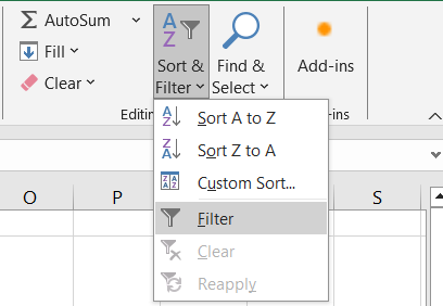
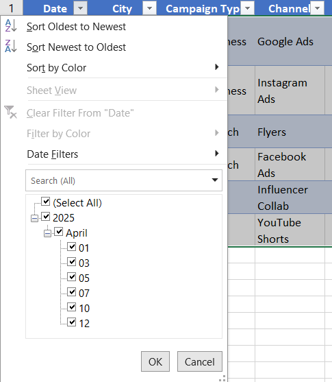
After selecting the filter option, you will see a drop-down arrow on each column heading. To apply filters to any columns, simply click the drop-down arrow and select the cells you want to filter out.
Step 5: Plan the Layout of Your Dashboard
After you’ve organized your data and defined your KPIs, create a new worksheet and call it “Dashboard.” This sheet will hold all of your charts, visualizations, and summaries. Decide how you want to organize the information:
- Top Section: Key metrics (KPIs) in summary cards.
- Middle Section: Charts and graphs for trends and comparisons.
- Bottom Section: Detailed tables or supporting data.
Keep the design simple and logical. Group related elements together and leave enough white space to avoid clutter.
Step 6: Build a Pivot Table to Summarize Data
Now, you have your structure in place, it’s time to begin analyzing. Pivot Tables are excellent for summarizing huge datasets.
To make a PivotTable, first create another worksheet named “Pivot Reports” and then add a PivotTable to it. This will allow you to perform well.
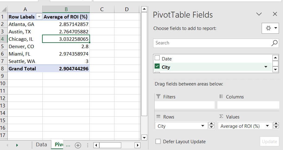
How to create a Pivot Table: Example – Average ROI by City
- Click any cell in the table.
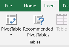
- Go to Insert > Pivot Table.
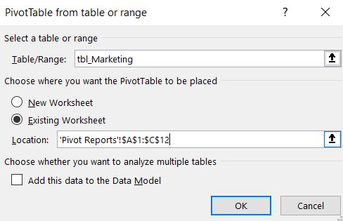
- Choose to place it in “Pivot Reports”.
- Set up:
- Rows: City
- Values: Average of ROI (%)
Similarly to how you created this pivot table, you can create others, such as in Budget & Revenue by Campaign Type, enter:
- Rows: Campaign Type
- Values: Sum of Budget Spent, Sum of Revenue Generated
And for Leads & Sales by Channel
- Rows: Channel
- Values: Sum of Leads Generated, Sum of Sales
Step 7: Insert Excel Charts for Data Visualization
Charts make your dashboard more visually engaging and easier to understand. Excel offers several chart types:
- Line Charts: For trends over time.
- Bar/Column Charts: For comparing categories.
- Pie Charts: For proportions.
- Combo Charts: For showing multiple data series.
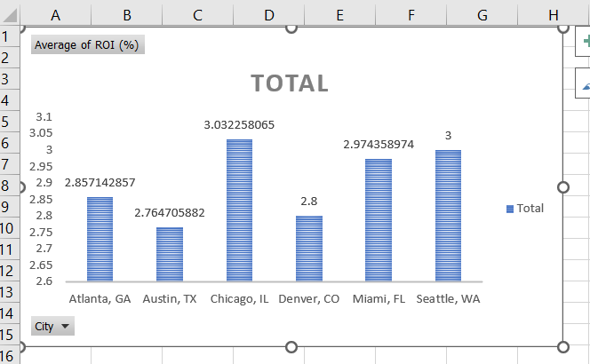
Once your pivot tables are complete, start making charts to display the summary.
- Select your pivot table, then click the Insert > Chart and select a chart type that matches your data.
You can now follow the same steps to get Budget & Revenue by Campaign Type and Leads & Sales by Channel.
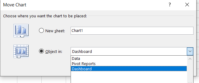
After you’ve built all of the charts and graphs, move them to a separate sheet named “Dashboard” that you have created before. So that your data remains organized.
Right-click on the table, select Move Chart, then pick “Dashboard sheet”.
Step 8: Add Slicer or Filters
After you’ve finished creating charts and graphs, you can make them more interactive by adding filters or slicers. Follow these steps to add Slicer and Filters.
Slicers:
- Slicers allow users to filter data visually.
To add slicer
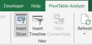
- Click a Pivot Table
- Go to PivotTable Analyzer → Insert Slicer
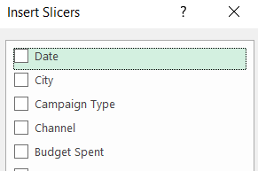
- Add slicers for City, Campaign Type, and Channel.
Drop-Down Menus:
- Use Data Validation to create drop-down menus for user input.
- Steps:
- Select a cell.
- Go to Data > Data Validation.
- Choose “List” and enter your options.
Step 9: Add Final Touches
Now that the dashboard has been organized, let’s make the final adjustments. You can modify the text, color, and format of your charts to make them look better. You have full control to personalize them according to your preferences.
- Create a New Worksheet:
- Use this sheet as the dashboard interface.
- Arrange Elements:
- Position charts, pivot tables, and slicers logically.
- Use text boxes for titles and annotations.
- Add Visual Appeal:
- Use consistent colors and fonts.
- Group related elements using borders or shapes.
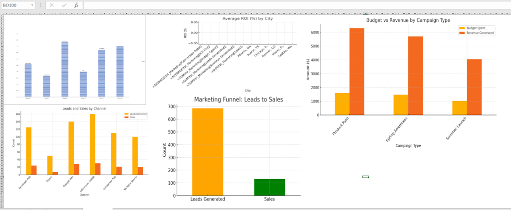
Example Layout:
- Top: Title and date range filters.
- Middle: Key metrics and charts.
- Bottom: Detailed table with slicers.
Step 10: Test and Refine
Before sharing your dashboard, test it thoroughly:
- Check Interactivity:
- Ensure slicers and filters work as intended.
- Verify that charts update automatically when data changes.
- Validate Accuracy:
- Double-check formulas and pivot table calculations.
- Seek Feedback:
- Share a draft with colleagues or friends to gather input on usability and design.
Step 11: Protecting and Sharing Your Dashboard
You can protect the worksheet to keep users from mistakenly changing data or formulas.
- Go to the “Review” tab and select “Protect Sheet.”
- You can set a password and control what users can or cannot do.
If you want to share your dashboard with others, you can do so as an Excel file, template, or read-only PDF. This ensures that your ideas are shared securely and properly.
Common Mistakes to Avoid
A few things can reduce the effectiveness of your dashboard. These include using too many bright colors, displaying too much raw data instead of summaries, and overcomplicating the layout. Another frequent mistake is forgetting to update or refresh data connections. Keep it clean, relevant, and user focused.
Bonus Tips for Beginners
- Keep It Simple: Focus on essential insights. Avoid overloading the dashboard with unnecessary details.
- Use Templates: Explore Excel’s built-in templates or download free ones online for inspiration.
- Learn Shortcuts: Keyboard shortcuts like Ctrl + Z (undo) and Alt + F1 (create chart) can save time.
How to Build an Excel Dashboard: Wrap Up
Creating your first Excel dashboard might feel intimidating, but with a clear goal and the right steps, it becomes a manageable and even enjoyable process. In this beginner Excel dashboard tutorial, you’ve learned how to prepare your data, use PivotTables, and insert Excel charts and visuals that help you better understand and present your insights.
Whether you’re tracking campaign performance, managing budgets, or summarizing key metrics, building a dashboard lets you make smarter decisions faster.
As you continue to practice and experiment, you’ll find even more ways to create a dashboard in Excel that suits your unique needs. Just remember; keep it clean, focused, and visually clear for your audience. With time, building impactful dashboards will become second nature.

