Data visualization is becoming the most critical skill for communicating insights these days. When working on larger Excel data sheets, understanding larger data sets and textual data tables might be difficult. Using visuals to present data can simplify the interpretation of complex information and enhance clarity. When it comes to displaying data, bar charts are one of the most efficient ways to convey clear and concise comparisons.
Whether you’re a student, business analyst, marketer, or data enthusiast, learning the stacked bar chart in Excel can help you improve your reporting and presenting skills.
In this comprehensive, step-by-step tutorial, we’ll walk through everything you need to know to create a professional stacked bar chart in Excel, from understanding its purpose to customizing its appearance.
What is a Stacked Bar Chart in Excel?
A stacked bar chart displays multiple data series layered within a single bar, either vertically or horizontally, to show both the total value and individual components across categories as well as each series’ specific contribution. In a stacked bar, you can represent information in horizontal bars where each bar represents a specific category or data point. Each segment of the bars is a different color, representing different values.
When we use a stacked bar chart, it becomes easier to understand the total value of each category. At the same time, you can also see how much each smaller part contributes to that total.
In one single bar, you can see two things:
- The overall total
- And the size of each part within that total
This type of Excel chart helps you to quickly compare which category has a bigger or smaller share and spot any trends or patterns.
How Can We Make a Stacked Bar Chart in Excel? Step-by-Step Tutorial
Step 1: Prepare Your Data
Before you begin creating your chart, your data should be organized in a tabular format. When you organize your data in a tabular format, the data points will be categorized into columns.
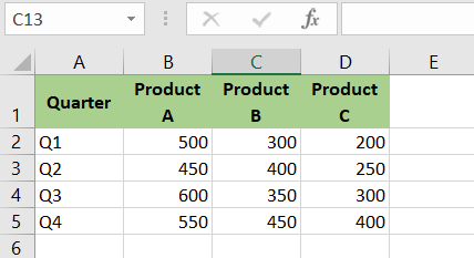
In the example above, you want to assess the quarterly sales of three different products and determine which product performed the best in each quarter.
Step 2: Select the Data
Once your dataset is structured in a table layout, highlight the range you wish to visualize in the stacked bar chart. To do this, simply click and drag to highlight the full data range, including the headers.
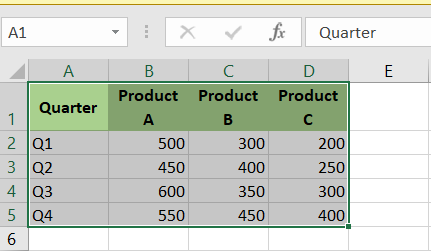
As you can see, the selected data is highlighted by a border for visual confirmation.
Step 3: Insert the Stacked Bar Chart
- To begin creating your stacked bar chart, click on the Insert tab in Excel’s ribbon.
- This will open the charting tools you need.
- Under the Charts section, choose the Bar Chart or Column Chart icon to proceed.
- Choose a Stacked Bar or Stacked Column, depending on your preference. Excel offers multiple stacked bar chart formats, including 2D, 3D, and 100% stacked types. Choose the one that fits your data best.

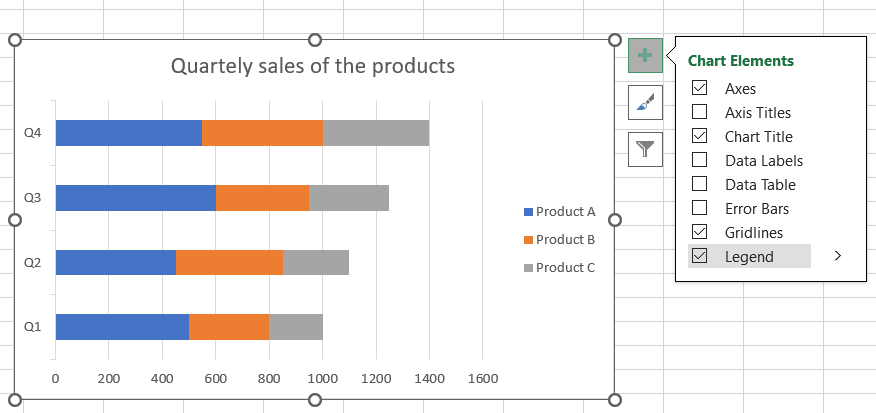
Step 4: Adding Title and Legend
After inserting the stacked bar chart, you can add a title and a legend to make it more informative. Your chart’s title will represent its theme. The legend of the chart will represent the details about the categories specified by the various sections of the graph.
After you’ve created your stacked bar chart, an option for chart titles will appear. You can choose it and then edit it accordingly.
To add the legend to the chart, click the + sign in the top left corner of the stacked bar chart and then select legend.
After changing the title of the stacked bar chart, you will gain access to other options such as title background color, border, and other customization options.
To get access to these customization options, you just have to click +, select the title option, click the dropdown arrow, and select more options.
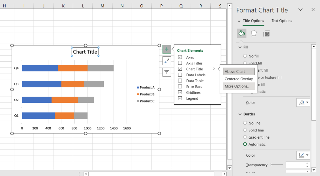
After customizing the title, you can modify the legend using the same steps as the title. You can adjust the legend’s position, text font, colors, background color, and other settings.

Step 5: Customization of Your Stacked Bar Chart in Excel
After creating your stacked bar chart, you can quickly customize it to add a personal touch. You can change the colors, labels, axes scales, chart styles, and other elements to make it more visually appealing.
1. Axis Titles
Follow these steps to modify the axis labels after creating your stacked bar chart.
- In the upper-right corner of your chart, you will see a + icon; click it first.
- Check Axis Titles and label them appropriately (e.g., X-Axis: “Quarter”, Y-Axis: “Sales”).
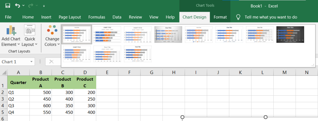
2. Chart Styles
In Excel, you can pick from a variety of chart styles to customize your stacked bar chart. Customizing the design of your stacked bar chart will give your charts a more professional appearance and feel. To do this, simply follow these steps and apply the styles that suit what you like best.
- First, click the chart design menu and then click the drop-down menu to expand the chart style options. After finding your perfect style, just click it to apply to your stacked bar chart.
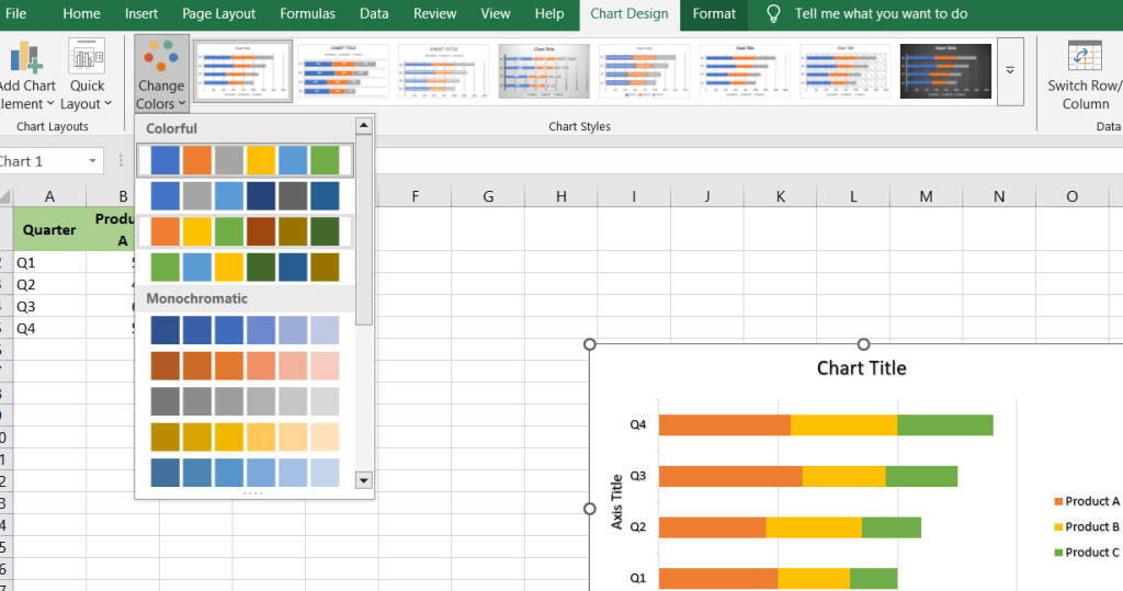
3. Color Scheme
If you don’t like the default color scheme, you can change it just by modifying the style.
- To do so, simply select the chart design menu and then the colors menu. Now, select the drop-down menu to expand the color options. At this point, you’re free to choose any color that suits your preferences.
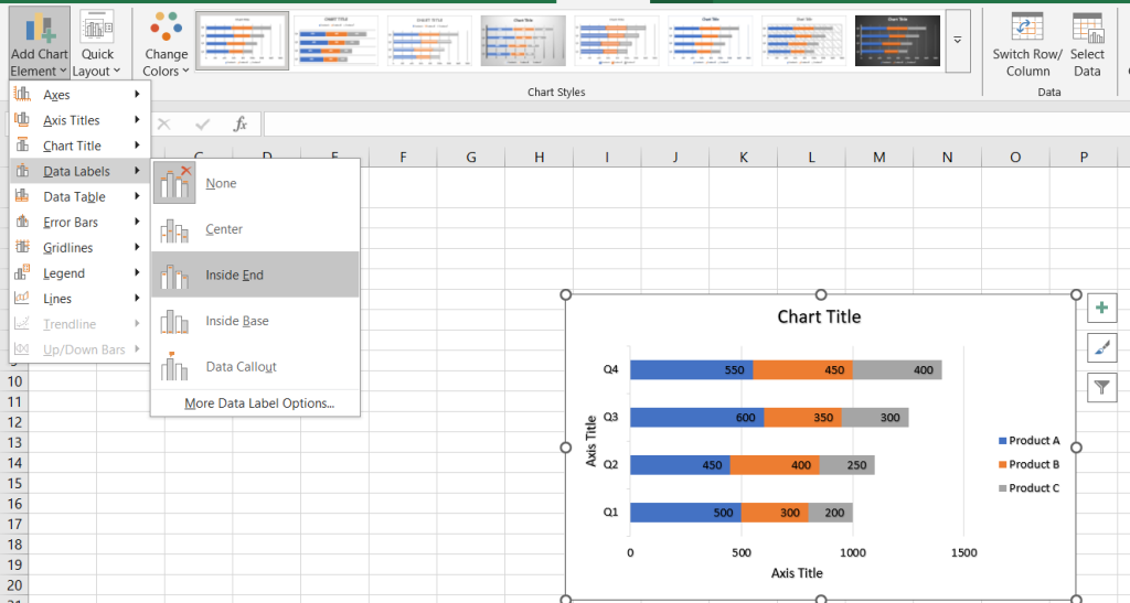
4. Data Labels
You can also use data labels on your stacked bar chart to show the exact numbers within every segment of the bar.
To do so, simply follow these steps.
- Click on the chart elements icon, then enable ‘Data Labels’ to show exact values on each segment. Now you can select the position of your data labels in each segment from the given options.
Step 6: Analyze and Interpret the Chart
Once your stacked bar chart is ready, it’s easy to interpret the data and draw meaningful conclusions. Now, you can see and assess which products did best in each quarter. You may track patterns over time and identify seasonal spikes or declines in sales.
At first sight, you might think that building a stacked bar chart is difficult, but it is not. Simply follow this Excel stacked bar chart tutorial to effortlessly design and modify it based on your own personal preferences.
Step 7: Saving and Sharing
Now, after creating the stacked bar chart in Excel, you can easily save and share it. To share your chart visually, consider saving it as an image file. To save it as an image, simply right-click and select “save as picture” before selecting the file format and saving it in your selected location.
When to Use Stacked Bar Charts
Stacked bar charts are best used when:
- You want to compare multiple part to whole relationships
- They’re ideal when you need to break down each category’s contribution within a total value.
- You’re comparing data over time.
- You have limited categories to display.
Avoid using them when:
- You need to compare values across many series.
- You’re analyzing fine differences between similar values (a line or clustered bar chart may be better).
Tips for Working with Stacked Bar Charts
1. Use 100% Stacked Bar Charts
If you want to compare the percentage contribution of each item rather than the absolute value, choose a 100% Stacked Bar Chart.
Example: Use this to show what percentage each product contributed to total sales per quarter.
2. Sort Your Data for Better Clarity
Sorting your data (e.g., highest to lowest total) before plotting helps in better interpretation.
3. Add a Secondary Axis (If Needed)
When one category’s values are much higher than the rest, using a secondary axis can help maintain visual clarity.
- If a data series dominates the chart, right-click it, choose ‘Format Data Series,’ and enable the secondary axis for better balance.
4. Use Data Tables
Adding a data table below your chart is great for making raw numbers available alongside visuals.
5. Interactive Filters with Slicers
If you’re using Excel Tables or Pivot Charts, you can add slicers to filter by category dynamically.
6. Avoid Clutter
Too many data series can make your chart unreadable. Limit the number of stacked elements to 3–5 for clarity.
Common Mistakes to Avoid
- Overloading the Chart: Too many stacked segments can make it difficult to compare.
- Misleading Scales: Always use appropriate axis scaling.
- Inconsistent Color Use: Keep the same color for each series across different charts.
- Ignoring Labels: Always include data labels or legends to avoid confusion.
- Not Sorting Data: Unsorted data can make patterns hard to detect.
Limitations of Stacked Bar Chart in Excel
Despite all of the perks of using a stacked bar chart in Excel, there are certain restrictions that you will need to keep in mind.
Customization is Limited
Excel provides only basic options for customizing your stacked bar charts. If you want to design something more complex or include interactive features, you will likely run into limitations.
Struggles with Big Data
If you work with larger data sheets and data sets, you may notice that Excel’s working speed slows down. This is because Excel cannot manage larger data sets, especially when creating and displaying stacked bar charts. You may encounter Excel performance issues and delayed chart rendering.
No Interactivity
Excel charts are static by nature. That means you can’t build interactive dashboards that allow users to filter or explore data dynamically, like switching between periods or datasets.
Manual Effort to Keep Charts Updated
If your data updates regularly, Excel won’t refresh charts automatically unless you set up complex formulas. Most of the time, you’ll need to manually update the chart.
Not Ideal for Team Collaboration
Real-time collaboration isn’t Excel’s strong suit. You’ll need to send files back and forth, which can lead to version control issues and messy workflows.
Conclusion
Now that you’ve followed this Excel stacked bar chart tutorial, you’re well on your way to creating clearer, more impactful visualizations. Whether you’re analyzing sales, tracking project progress, or presenting survey data, knowing how to make a stacked bar chart in Excel can seriously boost your data storytelling skills. You’ve covered the essentials of Excel charts—adding titles, labels, legends, and customizing the look to suit your preferences. And the best part? You can now confidently create an Excel bar chart with multiple series without feeling overwhelmed. So play around with styles, tweak the colors, and make your data pop. The more you experiment, the more polished your stacked bar charts will become!