Microsoft Excel is a powerhouse when it comes to data visualization, offering various chart types to represent data effectively. One such powerful feature is the Excel Combo Chart, which allows users to display multiple types of data in a single chart.
But what exactly is a combo chart, and how can you use it to make your reports and presentations more effective? This guide will take you through everything you need to know about combo charts in Excel, from their purpose to practical applications.
What is an Excel Combo Chart?
A Combo Chart (Combination Chart) in Excel is a chart that combines two or more different types of charts into one. The most common combination includes a column chart and a line chart. This allows users to represent multiple sets of data in one chart while maintaining clarity and effectiveness.
Combo Charts are particularly useful when comparing two sets of data that have different scales. For example, if you want to compare sales revenue (in dollars) with the number of units sold (in thousands), plotting both on the same axis might not be meaningful. A Combo Chart helps by allowing one data set to use a secondary axis.
Benefits of Using a Combo Chart
- Enhanced Data Visualization: A Combo Chart helps in presenting multiple data sets clearly, making it easier to interpret trends and comparisons.
- Comparing Different Scales: When data series have different units or value ranges, a Combo Chart can accommodate them using a secondary axis.
- Flexibility: You can mix and match chart types like line, column, area, and bar charts to create a more insightful representation of your data.
- Improved Decision Making: By combining two types of charts, users can extract meaningful insights and patterns that would otherwise be hard to detect in separate charts.
When to Use a Combo Chart
You should consider using a Combo Chart in Excel when:
- You have two different data series with different units or scales.
- You want to emphasize a specific trend while keeping other data visible.
- A single chart type (like a bar chart or line chart alone) does not effectively represent your data.
- You want to compare a categorical and continuous dataset.
Examples of When to Use a Combo Chart:
- Sales Performance Analysis: Compare monthly revenue with the number of products sold.
- Budget vs. Actual Analysis: Show budgeted expenses as a column chart and actual expenses as a line chart.
- Financial Reports: Show revenue alongside profit margin percentage.
- Website Analytics: Display website traffic in one chart and conversion rates in another on the same graph.
- Market Trends: Compare the number of customers with revenue generated over time.
- Temperature vs. Rainfall Data: Represent temperature using a line chart and rainfall using a column chart.
How to Create a Combo Chart in Excel
Creating a Combo Chart in Excel is simple and can be done in just a few steps.
Step 1: Prepare Your Data
To create a Combo Chart, you need a well-structured dataset. Let’s take an example dataset:
| Month | Sales Revenue ($) | Units Sold |
|---|---|---|
| Jan | 50,000 | 500 |
| Feb | 65,000 | 700 |
| Mar | 80,000 | 850 |
| Apr | 75,000 | 780 |
| May | 90,000 | 920 |
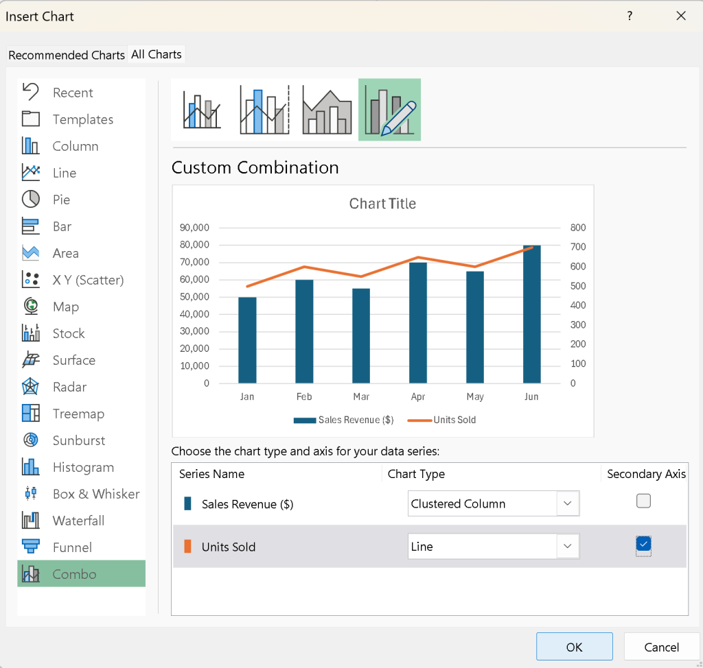
Step 2: Insert a Combo Chart
- Open Excel and enter your data into a worksheet.
- Select the entire dataset, including column headers.
- Go to the Insert tab in the Excel ribbon.
- Click on Insert Combo Chart in the Charts group.
- Select Custom Combo Chart.
Step 3: Choose Chart Types for Each Data Series
- In the Insert Chart dialog box, you will see two data series: Sales Revenue and Units Sold.
- Assign Sales Revenue to a Column Chart.
- Assign Units Sold to a Line Chart.
- Check the box for Secondary Axis for the Units Sold series to make the visualization clear.
- Click OK to insert the chart.
Step 4: Customize the Combo Chart
Once the chart is inserted, you can improve its appearance:
- Change Chart Title: Click on the default title and replace it with a meaningful title like “Monthly Sales Performance.”
- Format Axes: Right-click on the vertical axis, choose “Format Axis,” and adjust the scale for better readability.
- Data Labels: Add data labels to make values clearer.
- Legend Positioning: Adjust the legend placement to avoid clutter.
- Change Colors: Use distinct colors for the column and line series to make them easily distinguishable.

Advanced Customization Options
1. Adding Data Labels
To add data labels:
- Click on the chart and then on one of the series.
- Go to the Chart Elements (+ icon in the top-right corner of the chart).
- Check Data Labels and choose a position (e.g., inside or above the bars for a column chart).
2. Changing Axis Scale
If your chart has a secondary axis, adjusting the scale can improve clarity.
- Right-click the secondary axis and select Format Axis.
- Modify the Minimum and Maximum values to better fit the data.
3. Adjusting Line and Column Width
- To change line thickness, right-click the line chart series, select Format Data Series, and adjust the Width under Line Options.
- To change column width, right-click a column and adjust Gap Width.
4. Adding a Trendline
If you want to show trends in the data:
- Click on the line series.
- Go to the Chart Elements (+ icon) and check Trendline.
- Choose the type of trendline (e.g., linear, exponential) that best fits your data.
Best Practices for Using Combo Charts
- Keep It Simple: Avoid overloading the chart with too many data series.
- Use a Secondary Axis Wisely: Only use it when data series have significantly different scales.
- Label Clearly: Ensure axis labels, legends, and data labels are easy to understand.
- Choose Colors Thoughtfully: Use contrasting colors to differentiate between series effectively.
- Maintain Readability: Avoid cluttered elements that make interpretation difficult.
Conclusion
A Combo Chart in Excel is a powerful tool for comparing multiple data series with different scales. It is especially useful in business reports, financial analysis, and trend comparisons. By following the steps outlined in this guide, you can create and customize Combo Charts to make your data more insightful and visually appealing.
Start experimenting with Combo Charts today and unlock the power of effective data visualization in Excel! If you want to master more Excel techniques, check out our Excel Tutorials for more expert tips!